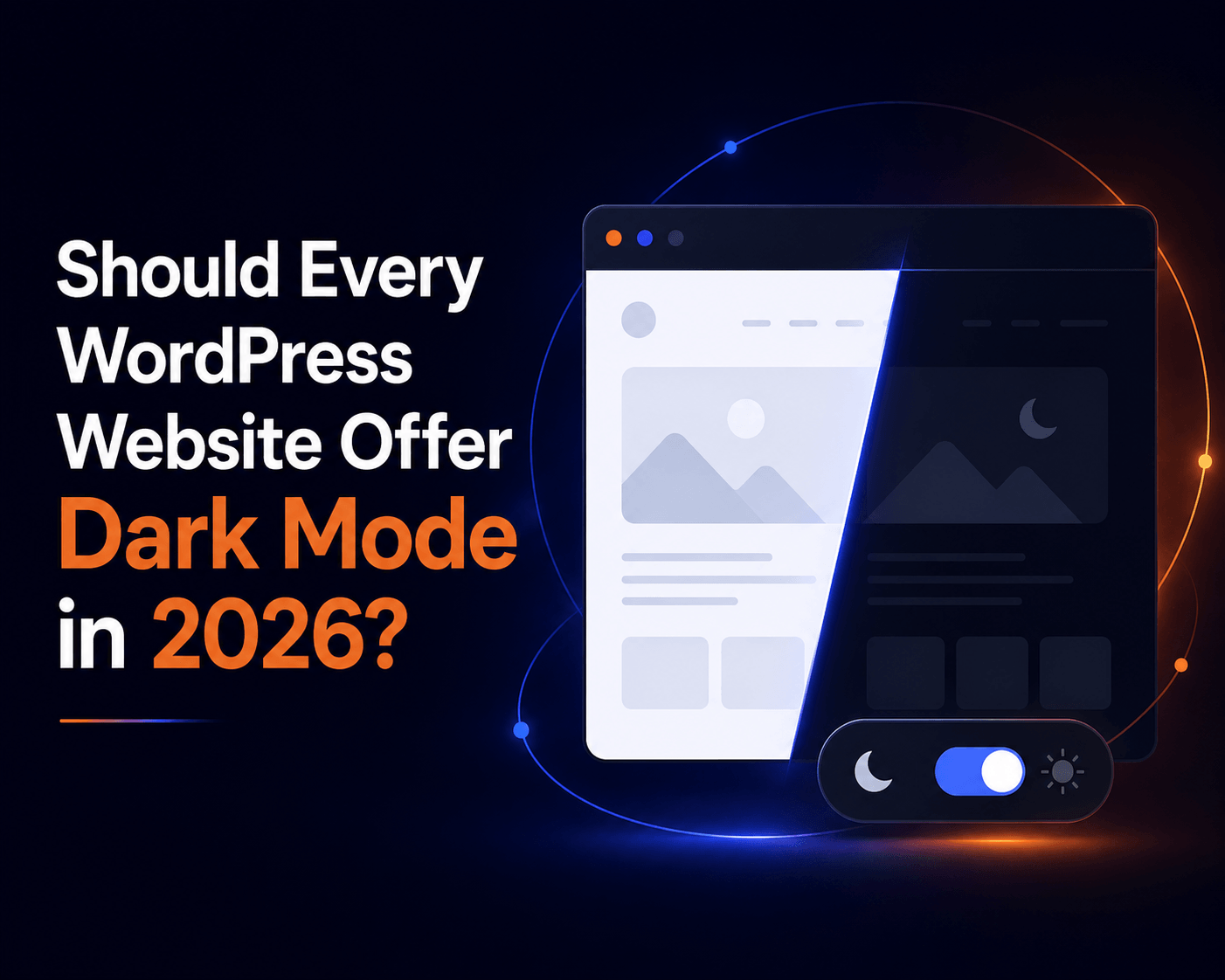
According to the question, should every WordPress website offer Dark Mode in 2026? The answer would be, Yes, almost every WordPress website should offer dark mode in 2026, but it should be a choice your visitors control, not something you force on everyone. The bigger truth is that every website owner now owns WordPress dark mode and accessibility, and it should be a focus.
Dark mode is one comfort option among many, and visitors expect to choose what works best for their eyes. An accessibility option is to incorporate it into your site design to help all people with disabilities feel comfortable. That will make your website audience feel more connected and increase your site’s acceptance right away, which will eventually boost your site traffic, engagement, and inclusivity.
Now, in this guide, we are going to explain why dark mode matters now, where its limits are, the mistakes to avoid, and how to add both dark mode and accessibility the right way without adding code and extra effort.
WordPress Dark Mode and Accessibility in 2026: What Actually Changed
Not long ago, dark mode was a “nice extra” that a few design-savvy sites offered. In 2026, the picture is very different. The expectation has shifted, and the way people interact with a website has shifted with it.
Dark Mode is Now an Expectation
Open almost any phone, laptop, or popular app today, and you will find a dark theme built right in. People have grown used to it. Many now keep their devices in dark mode all day, especially for reading and evening browsing. So when someone taps through to your bright white WordPress site at 11 p.m., the sudden flash of light feels jarring and a little dated.
This is the quiet part that matters for your brand. Visitors rarely complain about the lack of dark mode. They just feel that your site is slightly behind, and they may not stay as long and leave. A simple dark mode toggle signals that your website is modern, thoughtful, and built with the visitor’s comfort in mind. In a year when most of the web has caught up, not offering the option is what will affect your website’s online presence and make you fall behind the latest trend for sure.
Accessibility has Now Become a Necessity
Here’s the development many WordPress owners missed. Accessibility is no longer just good manners. It now carries legal weight in major markets.
The European Accessibility Act (Directive (EU) 2019/882) has been enforceable across all 27 EU member states since June 28, 2025. It covers e-commerce, banking, transport, telecoms, and digital services, and it reaches businesses outside the EU that sell to EU customers.
This isn’t theory. Within months of the deadline, disability groups in France issued formal legal notices to major retailers over inaccessible sites, escalating to court proceedings by late 2025. Existing services have a transition window until June 28, 2030, but new products and services must comply immediately. Penalties are set nationally and vary widely, ranging from warnings to fines of up to €100,000 per violation in Germany and to turnover-based ceilings elsewhere. The law affects roughly 87 million people with disabilities across the EU.
It all rests on WCAG 2.1 Level AA, the same standard the web has used for years. So when we talk about WordPress dark mode and accessibility in 2026, we’re talking about two things visitors and regulators now expect together: comfort and inclusion.
The standards behind all of this are based on WCAG 2.1 Level AA, the same accessibility guidelines the wider web has rallied around for years. So when we talk about WordPress dark mode and accessibility in 2026, we are really talking about two things that visitors and regulators now expect side by side: comfort and inclusion.
Better UX Helps You Rank
There is a third quiet shift. Search engines and AI answer tools increasingly favor pages that people find easy and pleasant to use. Comfortable reading, clear text, and a site that respects different needs all signal to search engines that help you rank, such as longer time on page and lower bounce rates. Dark mode won’t rank you on its own, but a better overall experience helps, and accessibility widens the audience that can actually use and share your content.
Key Benefits of Dark Mode
Dark mode is popular for genuine reasons, not just looks. Here’s what it actually does well.
Comfort in low light
In a dim room, a bright white screen can feel harsh and tiring. A dark theme is gentler in those conditions, which is exactly why so many people switch to it in the evening or in bed. For night-time readers, it’s a real comfort upgrade.
Help for light sensitivity
For people with photophobia or certain vision conditions, bright screens can be painful. Dark mode helps people with light sensitivity, giving them a more usable, less straining way to read your content. For these visitors, it’s not a preference. It’s what makes your site usable at all.
Battery savings on modern phones
On OLED or AMOLED phones, dark pixels use less power because those screens can switch individual pixels off to achieve true black. That means dark mode can meaningfully stretch battery life on many modern phones. On older LCD screens, the savings are small, since the backlight stays on, so this is a “modern phone” perk rather than a universal one.
A modern, premium brand feel
A well-built dark theme often makes a brand look sleek and current. It’s the same instinct behind premium apps offering a polished dark interface. For portfolios, agencies, and product sites, that first impression can matter a lot.
Better engagement and time on page
When reading feels comfortable, people stick around. Less squinting means more scrolling, more reading, and more chances for them to reach your call to action. Comfortable visitors are engaged visitors, and engaged visitors are far more likely to subscribe, enquire, or buy.
These are all solid wins. But they come with one important condition, and ignoring it is where many websites go wrong.
Should Every Site Force Dark Mode?
Here’s the nuance that most “just turn on dark mode” articles skip, and getting it right is what separates a thoughtful website from a careless one.
Why dark mode isn’t perfect for everyone
Dark mode is not automatically better for all eyes. In fact, there is no definitive scientific consensus that dark mode is universally better for your eyes.
The clearest example is astigmatism, a common condition that affects roughly 47–50% of the population. For many of these people, light text on a dark background can appear to bleed, blur, or glow, an effect designers call “halation” or the halo effect. Letters look fuzzy, and reading turns into work. In bright rooms, dark mode can actually increase eye strain because dilated pupils make it harder to focus on lower-contrast text.
It’s not just about astigmatism, and the picture is genuinely mixed across different needs that are mentioned below:
- Some people with dyslexia find dark backgrounds reduce visual stress, while many others prefer light backgrounds with colored overlays instead
- For some color-blind users, low contrast between text and background in dark mode can make content harder to read
- Conditions like cataracts can make text harder to read against a dark background due to light scattering
In short, dark mode helps a large group of people and hurts the experience for another large group. That’s the whole reason forcing it on everyone is the wrong call.
Offer Dark Mode as a choice, not a default
The right approach in 2026 is refreshingly simple. You need to give your visitors the ultimate control. Let people who love dark mode switch it on. Let people who read better on a light background keep it. And ideally, let the site quietly match whatever a visitor’s device is already set to, so it feels right from the first second.
Choice is the accessible answer. A toggle acknowledges that no single setting works for everyone.
Key Takeaways
Don’t force dark mode. Offer it as a visitor-controlled option, ideally alongside other comfort tools. That choice is what turns dark mode from a design trend into a real accessibility feature.
Common Dark Mode Mistakes WordPress Owners Make
Before we talk solutions, it helps to know the traps. These are the slip-ups that turn a good idea into a bad experience.
- Forcing dark mode on by default hurts roughly half of visitors who may struggle with light-on-dark text, and it always lets people choose.
- Using a “color inverter” that breaks everything: Cheap scripts simply flip every color, leaving washed-out photos, unreadable buttons, broken logos, and weird tints. A good dark mode adjusts each element thoughtfully.
- Ignoring images and media: Bright photos that don’t adapt can blast a visitor’s eyes, or product shots can lose their true colors. Images need care, not a blanket filter.
- Forgetting WooCommerce pages: Many plugins style the homepage nicely but break the cart and checkout, exactly where you don’t want friction.
- Treating dark mode as the whole accessibility story: It helps comfort, but does nothing for someone who needs bigger text, a clearer font, stronger contrast, or a keyboard-friendly menu.
- Slowing the site down: Some plugins load heavy files on every page, even when no one uses them. Speed matters for visitors and SEO.
Dark Mode Alone Is Not Accessibility 2026 Shift
This is the real mindset change for 2026. Dark mode is one comfort setting. True accessibility means offering a small set of controls so each visitor can shape the page around their own needs.
Picture the range of people who land on your site in a single day. One person needs larger text because small fonts are a struggle for them. Another reads far better with a bold, clean font. Someone gets distracted or even dizzy from moving animations and wants them to stop. Another needs a stronger contrast to distinguish the text from the background. And someone is navigating entirely with a keyboard because using a mouse isn’t an option for them.
Dark mode helps the first group, the night readers, and those with light sensitivity. It does almost nothing for everyone else on that list. That’s why the smartest WordPress sites in 2026 pair a dark mode toggle with an accessibility panel. One friendly button that opens a handful of comfort controls that visitors can switch on themselves, including ark mode
This is the difference between what you added, and you made our site work for more people. The second one is what 2026 rewards, with happier visitors, a wider audience, and better alignment with the direction the law is heading.
How Darklup Solves Dark Mode and Accessibility Issues In 2026
This is exactly the gap Darklup was built to close. With its version 4.0.0 release in April 2026, Darklup grew from a leading dark mode and accessibility plugin for WordPress into a complete dark mode and accessibility solution, and it does it without making you rebuild your site.
Provide Smart Dark Mode Options
Darklup doesn’t just flip colors and hope for the best. Its Dynamic Color Mode scans every visible element on the page, text, buttons, cards, images, and backgrounds, measures how bright each one looks to the human eye, and adjusts each element on its own. Light elements are darkened; dark ones are left alone or gently tweaked so layouts don’t break and photos don’t turn into washed-out blurs.
On top of that smart engine, you get the controls that make dark mode feel effortless:
- OS-based dark mode that switches on automatically based on the visitor’s device settings (macOS, iOS, Windows, Android), so the site matches their preference before they click anything.
- Time-based dark mode that follows a schedule you set, for example, bright through the day and dark in the evening.
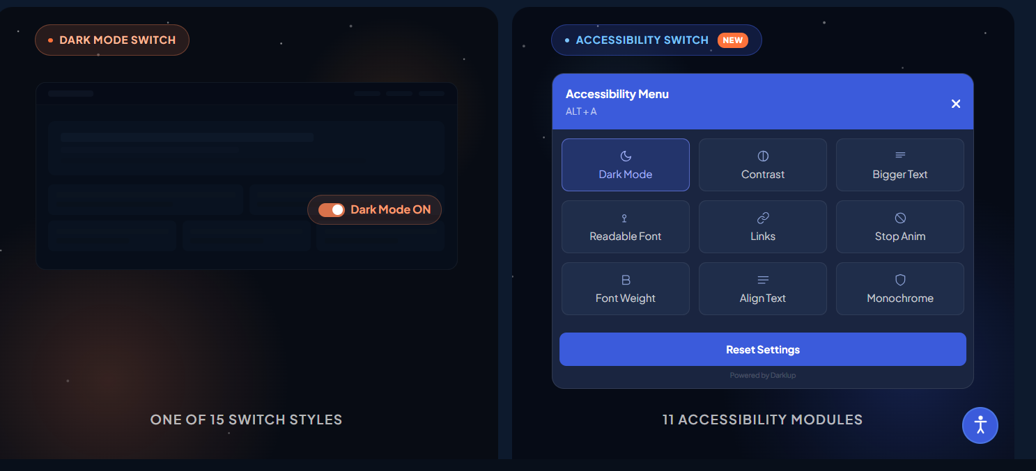
- 15+ floating switch styles so the toggle matches your brand and sits exactly where you want it.
- WooCommerce support that keeps product grids, single product pages, cart, and checkout clean in dark mode, with product images staying true to life.
- Image replacement and custom CSS for full control, so you can show a different image in dark mode or fine-tune specific sections yourself.
This directly solves the “color inverter that breaks everything” mistake. Darklup adapts to your design instead of fighting it.
Built-in Complete Accessibility Module
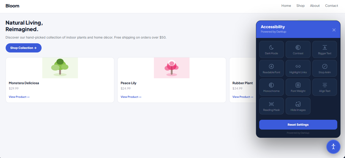
This is the headline 2026 upgrade. Instead of only a dark mode button, Darklup can show an Accessibility Switch that opens a panel of 11 ready-to-use tools. Visitors pick what helps them, including:
- Dark Mode: One option among many, never forced on anyone
- Contrast Modes: For people who need a stronger contrast to read clearly
- Bigger Text: Larger text that doesn’t break your layout, so there’s no need to pinch-zoom
- Readable Font and Font Weight: A cleaner font and bolder letters for easier reading
- Reading Mask: Highlights one line at a time and dims the rest so that people can keep their place
- Stop Animations, Hide Images, Highlight Links, Monochrome, and Align Text: Small but powerful controls for focus, comfort, and clarity.
Best of all, each visitor’s choices are saved in their browser and remembered on every page and every future visit. The free version covers core tools like dark mode, bigger text, and contrast, while Pro unlocks the complete set, including Reading Mask, Monochrome, and Font Weight.
This is how Darklup answers the bigger question for 2026. It doesn’t just add a dark theme. It hands each visitor a small set of comfort controls so your site works for many more people.
Keyboard-Friendly and Visitor-Controlled
The panel is built for people who don’t, or can’t, use a mouse. Visitors can open it with Alt + A, move through the tools with Tab, turn them on or off with Enter or Space, and close it with Esc. Keyboard access like this is a core part of modern web accessibility and the WCAG 2.1 guidelines that today’s laws point to.
A note for honesty, because it builds trust with your readers, and you can keep this point in your published post. An accessibility panel improves the experience for many visitors, but it’s a user-facing comfort tool, not a full code audit. It supports your accessibility efforts. It doesn’t make a site fully WCAG-compliant on its own. Darklup is upfront about this, and being upfront in your own content makes you more credible, not less.
Light on Speed, Easy on Setup
Performance is handled with care. Darklup loads its panel files only when the Accessibility Switch is turned on, so there’s no additional weight on your pages otherwise. It works with major themes and page builders like Elementor, Divi, and WPBakery, and it’s fully customizable, including accent color, button size, position, and which tools to show. That solves the “slows the site down” and “breaks on my theme” worries in one go.
How to Add Dark Mode and Accessibility to WordPress (Step by Step)
You don’t need a developer. Here’s the simple path with Darklup.
Install and activate Darklup
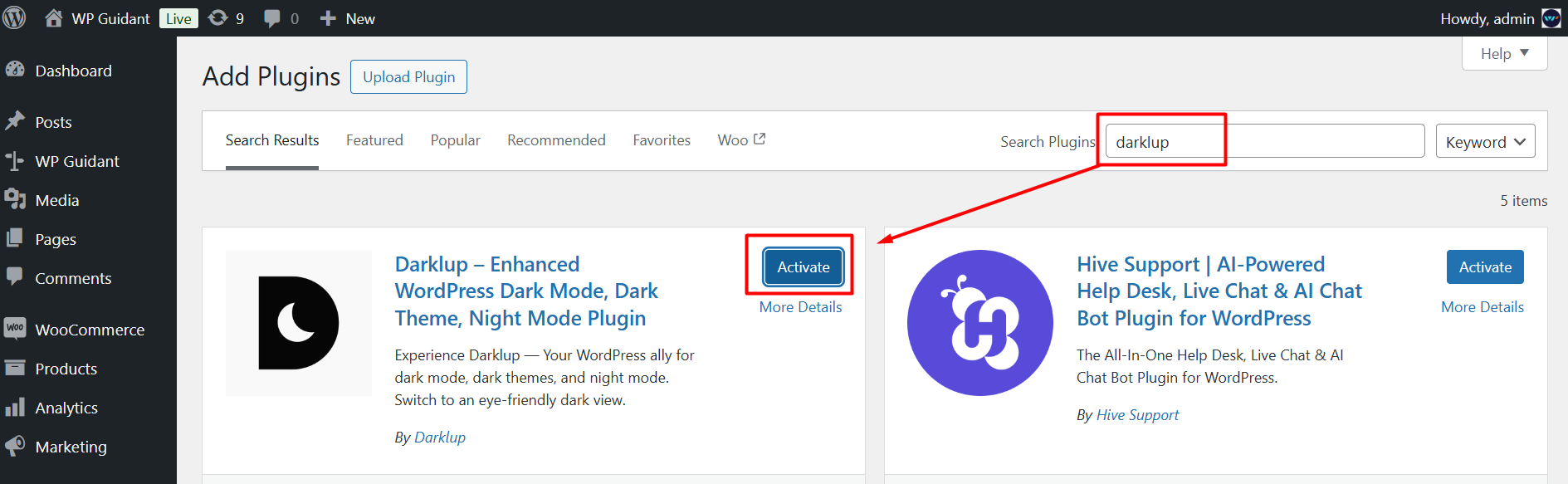
Grab the free version from the WordPress plugin directory, or go straight to Pro for all 11 tools. Activation takes about a minute.
Note: Follow this documentation to install Darklup Lite, and to install Darklup Pro, follow these linked guides.
Choose the Accessibility Switch
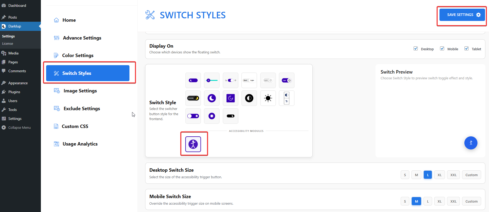
In the Darklup dashboard, open Switch Styles, go to Floating Switch, scroll to the Accessibility icon, select it, and save. This replaces the plain dark mode button with the full accessibility panel.
Customize and go live
Pick your panel colors, button size, and position, then choose which tools to show or hide. Save, and it’s live, usually in about two minutes total.
That’s it. No code, no theme surgery, and you can change the tools on or off any time without rebuilding a thing.
Who Should Add Dark Mode and an Accessibility Panel in 2026?
| Site Type | Should you offer it? | Reasons |
|---|---|---|
| Online store / WooCommerce | Strongly yes | Comfort, better checkout experience, and possible legal duty |
| Blog/content site | Yes | Longer, more comfortable reading and lower bounce |
| Business / corporate | Yes | Looks modern, signals inclusion, supports compliance |
| Portfolio/photography | Yes | Use a smart mode that keeps images true to color |
If your site is on this list, and almost every WordPress site is, the answer is to offer it.
Now It’s Time to Explore Darklup for WordPress
So, should every WordPress website offer dark mode in 2026? Yes, as an option for your visitors’ control, and ideally as part of a wider set of comfort tools. That’s the real meaning of WordPress dark mode and accessibility in 2026. Not forcing one look on everyone, but letting each person shape the page around their own eyes and needs.
Dark mode makes your site feel modern and comfortable. An accessibility panel makes it welcoming to far more people and keeps you aligned with where the web and the law are clearly heading.
Darklup gives you both in a single, easy-to-use plugin that comes with Dark Mode and built-in Accessibility, with a free version to start and Pro plans that include lifetime options when you are ready for the full WordPress solutions.
Now make your site easier on the eyes and open to everyone, and get started with Darklup today.
And if you want to read more useful blogs like this, don’t forget to subscribe to our blog page. Stay tuned!